Week 02 — Rhythm and Flow
Sep 28, 2015
I admit, I’ve had a hard time finding some sort of productive rhythm and flow in this beautiful surrounding during the last week. The weather’s been lovely after all and I’ve often walked down to the lake for a swim.
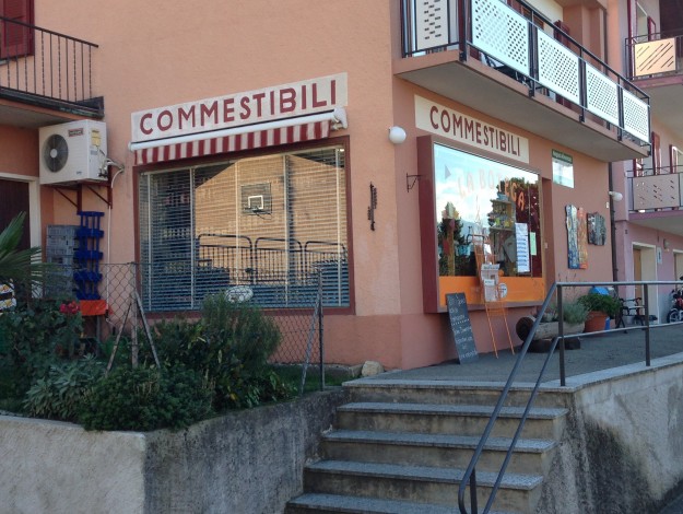
While trying to take various paths downhill, I’ve often passed by this little corner store (which is by the way, also the next possible shopping option up here):

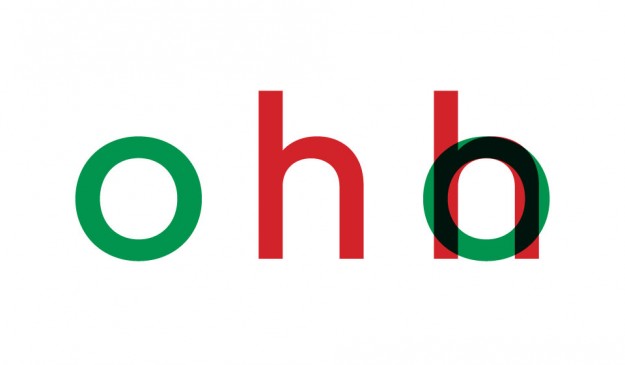
It appears the sign painter of this shop also had a hard time finding his rhythm and flow. The width of the letters COMMESTIBILI (food) are varying extremely and provide a well fitting charm to the outfit. A good example of one of many unintended styles choices amateurs repeatedly are doing. I believe that it’s mostly due the fact that letters seems to be based on a mathematical schemes or forms, when it’s actually better based on optical decisions. However, see an example of an corresponding width below.
